Tag Archives: user interface

ESPN on Xbox LIVE gets a makeover

The ESPN app on Xbox Live is getting its first major update since it launched last summer. The dashboard can be customized to feature your favorite sports teams so fans can see a daily feed of news and highlights from those specific teams; the addition of the ESPN BottomLine keeps fans in the know with breaking news and score updates; a Mini Guide can be called up from the bottom of the screen to give fans a preview and quick access to personalized sports content; and Reminders and Live Alerts can be set. Two new features that stand out are Split Screen and Voice Control with Kinect. Fans can watch two events at once (i.e. watch ESPN3.com live events on both screens or a live event on one while catching up on ESPN.com news and highlights on the other) and they can navigate through the Content Guide, skip to the next highlight, or play, pause, and rewind plays through voice control.

Remember that access to ESPN3.com live events is only available to customers of an affiliated service provider; if you’ve got that and you’re an Xbox LIVE Gold Member you’re set! Screenshots below, demo videos and full PR after the break.

[Via Engadget; ESPN]

Continue reading ESPN on Xbox LIVE gets a makeover

Google+ …what comes after Facebook? A comprehensive tour of Google’s attempt at social.

Google is the king of search. But when it comes to social networking…well, we only have to look at Wave (an experiment that failed) and Buzz (a Twitter competitor that never caught on) for that answer. With Google+, the search giant takes aim at Facebook and it wants to become the destination for socializing with the people you know and the ones you’ll make down the road. The Google+ Project is currently in “Field Test” mode meaning that the company is still working out the kinks and tweaking and adding features to the service while a small selection of users try it out. The project is by invitation-only, and I was able to snag an invite earlier today. Read on after the break as I take you on a tour through the interface and the handful of features the service currently offers.

Continue reading Google+ …what comes after Facebook? A comprehensive tour of Google’s attempt at social.

Google intros Voice Actions, Chrome to Phone; updates Gmail UI and contacts section, enables multiple account sign-in

On Thursday Google introduced a new app for Android devices called Voice Actions.  “Voice Actions are a series of spoken commands that let you control your phone using your voice.”  Sounds simple and yet it is extremely helpful.  There are a total of twelve voice actions you can perform by speaking into the device’s mic.  Including the already implemented method of performing a Google search with your voice, other actions include:

  • send text to [contact] [message]
  • listen to [artist/song/album]
  • call [business]
  • call [contact]
  • send email to [contact] [message]
  • go to [website]
  • note to self [note]
  • navigate to [location/business name]
  • directions to [location/business name]
  • map of [location]
  • set alarim for [time]
  • Here’s how a number of them work.  You can complete a text message or email without touching the (physical or on-screen) keyboard simply by saying “send text to Bill Will” or “send email to Bill Will” respectively.  The phone will take a second to understand your speech input and then present your message all ready for delivery.  Tapping send will shoot your message off.  Speak and send, it’s that simple.  Voice actions extend beyond text messaging and emailing.  Say there’s a restaurant you want to call to make reservations for dinner.  You know the name and location of the restaurant, but you don’t have the business’ phone number handy.  You could bring up the browser and find the number that way, but with voice actions you can more quickly and efficiently obtain and dial the restaurant’s number.  The voice action “Call Sarabeth’s in NYC” will prompt your device to quickly search the Internet (using Google Maps)  for the restaurant’s phone number by pinging the name and specific location.  Within seconds of your voice action you’ll hear your phone ringing the restaurant or place of business.  You can even use voice actions to find and listen to music.  When you say “Listen to The Decemberists” your phone will search across your music library and any number of related apps (Pandora, last.fm, etc.) to start playing music from that particular band.  “Note to self”, as cliche as it sounds, serves as another interesting voice action that’ll likely come in handy from time to time.

    Voice Actions require Android 2.2 (Froyo) and they are currently available for U.S. English speakers only.  Droid 2 owners will find the app preinstalled on their device.  If you have an Android 2.2 device, search ‘Voice Search’ in the Android Market to find the free download.

    Google also announced Chrome to Phone, a Chrome browser extention and Android app that communicate with each other to send browser-specific information from your desktop to your phone.  Once you have Chrome to Phone installed on your desktop and phone, you can send websites, directions, and phone numbers from your desktop Chrome browser to your Android device.  For example, say you’re catching up on national news at The New York Times website but you are interuppted and forced to leave home.  Simply tap the new phone icon located at the top right corner of your Chrome browser window and the website will appear on your Android phone.  Now let’s say you are planning a road trip using Google Maps in Chrome.  Instead of wasting paper by printing out the directions, now you can send the directions from your desktop to your phone.  The instant transfer will automatically open up the Google Maps app on your phone and you’re just a tap away from initiating a Google Maps Navigation route using the transferred location information.  One more example.  You want to make a reservation at Sarabeth’s in NYC and you found the restaurant’s phone number on your desktop.  Ready to make the call?  Highlight the phone number, tap the new phone button in Chrome, and the transfer will bring up your phone’s dialer prepopulated with the restaurant’s number.

    The Google Chrome to Phone Extention is available (in English only) to download today.  The free Chrome to Phone app requires Android 2.2 (Froyo) and can be found in the Android Market by searching ‘Chrome to Phone.’

    Look after the break to learn about Gmail’s latest updates.  There you’ll also find brief video demonstrations for Voice Actions and Chrome to Phone. Continue reading Google intros Voice Actions, Chrome to Phone; updates Gmail UI and contacts section, enables multiple account sign-in

    Google spruces up Images portal

    This week Google pushed out the most significant overhaul of Google Images since it was introduced way back in 2001.  The instantly recognizable cosmetic changes?  The portal has gone textless, opting for a tiled layout with instant scrolling.  When you input a keyword, Google will present 1,000 related images to you, allowing you to instantly scrub through the content without the hastle of clicking through various pages.  Since the text is gone, larger thumbnail previews result.  Where’d all the text go, you ask?  If you hover over a particular image, a “hover pane” will pop up and show you the image size, name, source, and Google’s “similar images” option.  When you click an image you are brought to a new landing page; the image will be produced on top of its source’s website.  When you click anywhere outside the image it disappears and reveals the source page so you can see exactly where it’s coming from.  Optimized keyboard navigation and Image Search Ads round out the updates.  Google is rolling out the new interface worldwide over the course of this week.  Check in now to see if you’ve got it.

    [Via GoogleBlog]

    MIT students watch Minority Report, make the “glove mouse” a reality

    Controlling a computer using nothing but your hands.  A feat we’ve all seen done before by Mr. Cruise in Minority Report.  As part of a final project in a digital media course, a couple of MIT students have created an extremely crude version of what we saw in the sci-fi movie.  Using gloves with LED tips and a webcam, the students demo how an on-screen image can be manipulated with various hand gestures.  So we’re not there yet, but at least we’re moving forward.  Take a look at the gloves in the gallery below.

    [Via MIT; Engadget]

    YouTube gets a facelift

    YouTube has gone ahead and given itself a makeover, pretty much making everything a whole lot more streamlined.  The overall look is stripped down and clean, making the video player the most prominent part of the screen real estate.  In the past, the user’s video information was placed in an expandable box to the right of the video.  All of that has been move and broken up into two different place.  Directly above the video player you’ll find the username link, more videos from that same user (when clicked it expands down to reveal a horizontal list of all their uploaded videos), and a subscribe button to subscribe to all of their videos.  Directly below the player you’ll find the video description that expands down to show category, tags, and more information about the video.  Next to the video description is the Views total; not only does it tell you the number of view the video has, but it can also be expanded down to share stats, links, and honors associated with the video.  Underneath the video description you’ll find a panel of buttons called the Actions Bar.  First there’s the new ratings system; a thumbs up/thumbs down model replaces the original 5 star rating system.  The Save To button allows you to favorite a video or add it to one of your playlists.  The Share button allows you to share the video via email, Facebook, Twitter, etc.  Lastly there’s the Embed and Flag buttons, to copy the video inside another website and flag a video as inappropriate, respectively.  If you happen to click on any video in a playlist, you will find the Next Up box, located in the top-right of the page.  Next Up makes for a consistent viewing experience; depending on what you search, the Next Up box will queue up videos related to your search.  And, if the auto-play option is turned on, the video player will automatically play the next video in the series as soon as the previous one is finished.  The video player itself hasn’t really changed much.  It includes the full screen and ‘make wider’ buttons, scrubbing controls with real-time time stamps, volume, and video quality options (360p to 1080p HD).  Other neat updates include Closed Captioning (which can be turned on in certain videos where you find the Annotations toggle) and a cleaned up comment section.

    Overall, the YouTube facelift really enhances the user experience.  Everything is organized, tidied up, and looking better than ever.  If it weren’t for those pesky ads, the whole thing would be downright perfect.

    [Via YouTubeBlog]

    Microsoft details WP7S at MIX’10: developers, developers, developers

    This past week Microsoft revealed more details surrounding its brand new mobile phone platform, Windows Phone 7 Series.  During their WP7S launch event last month, Microsoft showed off all the UI basics and promised more information to come this month at their annual conference held for developers and web designers called MIX.  And boy did they deliver.  MIX’10 proved to be a highly informative conference, focusing on how developers will get their applications onto WP7S devices.

    Technical details.  Third-party developers will have access to XNA and Silverlight tools to create applications for WP7S devices.  Microsoft is offering free dev tools, providing Visual Studio 2010 Express for Windows Phone and Expression Blend for Windows Phone, to get things started.  In addition to these programs, developers also have access to many services like Microsoft Location Service, allowing devs to make their apps location-aware, and Microsoft’s Notification Service, a push notification system much akin to Apple’s that allows devs to send notifications to users of their apps, regardless of the app being open.  Notifications slide down in a tray at the top of the screen (less obtrusive than Apple’s pop up way of doing it).  Other prominent services that devs are given include multitouch, accelerometer, and camera & microphone support.  If you are a developer or know someone who is a developer, Microsoft is offering free beta versions of the dev tools today at developer.windowsphone.com.

    Where will all the apps be sold, you ask?  In the Windows Phone Marketplace, of course!  Just like the rest of the hubs, the Marketplace hub will be “panoramic,” meaning menus are opened with left and right slide gestures.  Microsoft is encouraging all developers to create trial versions of their full apps.  The Marketplace supports credit card purchases, operator billing, and ad-supported content.  Purchased apps can be pinned to the user’s home screen for easy access.  Finally, the revunue split:  70% goes to the publisher, 30% to Microsoft.

    Marketplace partners.  Microsoft announced the first slew of app partners and they include exciting picks like Pandora, Sling, Shazam, EA Mobile, Namco, Foursquare, and the Associated Press.  Look after the break for a full listing of all partners.  A majority of the demos show that at least this initial batch of apps will deeply integrate with the WP7S look and feel (think panoramic views and shiny, sleek interfaces).  Many of them show off 3D animations, incorporate images and video, and they can reach into your local content (like a photo editing app opening up a picture you took).  The most interesting app demo came from Netflix.  They demoed a prototype app that supports Watch Instantly, allowing a subscriber to browse and watch their Netflix collection on the go.  Unfortunately this was being pushed as a concept, and we likely won’t see anything like it for some time.  Another exciting app demo showed off the gaming capabilities of WP7S devices.  The Harvest is a 3D Xbox Live-supported title that excited developers with its gorgeous graphics, destructable environments, and Xbox Live in-game leaderboard, gamerscore, and acheivement support.  Look in the gallery below for screenshots from some apps.

    Lingering questions are answered.

    Multitasking: WP7S will not support true multitasking.  Microsoft’s first-party applications will run in the background when exited, but third-party apps will remain in a suspended state until the device needs additional resources.  For example, Microsoft apps like Internet Explorer and the Zune music player will run in the background, but other apps like Yelp will be forced to quit when not in direct use at any point without notification when you start opening other apps and the device needs to access more resources.  This “intelligent app management” is also purportedly found in Google’s Android OS.

    Copy & paste: Following in the footsteps of its big competitor, WP7S will not support the copy & paste function at launch.  Apparently this was a conscious decision made by Microsoft; they believe cell phone users do not use this function very often.  Instead, Wp7S devices will use a data detection service that recognizes text input like phone numbers and addresses.  Hopefully they won’t take as long as Apple did with bringing clipboard functionality to its mobile OS.

    What’s contoso?: Contoso is the placeholder name Microsoft added to the Marketplace UI, and now we know its purpose for being there.  Microsoft has alloted a space in the Marketplace for phone carriers to put their own branded store.  So this is a separate place where Verizon Wireless can sell their content to users, for instance.

    Hardware minimum requirements: capacitive touch; A-GPS, accelerometer, compass, light and proximity sensors; 5 megapixel camera with flash and an independent camera button; 256MB RAM, 8GB Flash; DirectX 9 & codec acceleration; an ARMv7 Cortex/Scorpion CPU; and Back, Start, and Search face buttons.  Initially Microsoft will require all handsets to boast a 800 x 480 (WVGA) resolution screen.  An update will allow for 320 x 480 (HVGA) screens at a later undisclosed date.

    Exsisting WP7S devices: At Mobile World Congress, we were introduced to the Asus model.  At MIX, two new devices were unveiled–a Samsung slate and LG slider (the first with a keyboard).

    All in all, MIX’10 was a huge invitational for all developers and Microsoft welcomed them with open arms.  Microsoft is making it extremely easy for developers to jump into Windows Phone 7 Series by offering free dev tools.  With their stringent hardware minumim requirements and terriffic initial batch of app partners, the apps out of the gate should look great and function well.  With graphics-intensive games like The Harvest linking Xbox Live to cell phones, Microsoft could very well raise the bar for mobile gaming, giving the App Store and its growing number of sub-par games (and even the likes of DS and PSP) a tremble in their boots.  I am really digging Microsoft’s start-from-the-ground-up mentality and I am excited to see what developers can do with their brand new mobile platform.  However, as many have pointed out, Microsoft is stuck in a classic case of Catch-22: Microsoft wants customers to choose WP7S phones and developers to write programs for them.  But developers won’t bother pushing their apps into the Windows Phone Marketplace if customers aren’t attracted to WP7S phones, and customers won’t purchase WP7S phones if they don’t offer a wide-ranging marketplace of apps!  Microsoft still has more work to do.  Priority number one?  Come up with a good marketing campaign.

    [Via Engadget, here, here, here, here & here; Gizmodo; Slashgear]

    Continue reading Microsoft details WP7S at MIX’10: developers, developers, developers

    JooJoo tablet updates its UI before launch

    We first got wind of the JooJoo tablet back when Michael Arrington of TechCrunch was calling it the Crunchpad.  Flashforward to present day, and through a heated legal battle, one Chandra Rathakrishnan of Fusion Garage has taken over leadership of the forthcoming device.  When a product delay was announced in February due to capacitive touchscreen issues, Fusion Garage wasted little time to revamp the JooJoo’s user interface.  The most significant change can be found in the home screen (see above).  Instead of being limited to a solid color background, you can now customize it with a high-resolution image of your choice.  Navigation gestures have been updated, too.  The pinch-to-go-back gesture has been replaced with “a vertical swipe that brings down a status bar containing the home button, status indicators, browser navigation controls, and a combination address bar/search field.”  Also, there’s two new ways to scroll: “a two-finger scroll that works like a scroll wheel, and a single finger “pan” that works like a mouse arrow.”  You can choose from two on-screen keyboards–a standard, large keyboard and a smaller one designed for one hand that is less obstrusive.  In previous video demos, Flash video playback was questionable and Fusion Garage was quick to fix that.  Now Flash video plays fine, supporting a standard player, a “custom H.264 HD breakout player” and a wide range of codecs.  One more change, and it has to do with the hardware shell.  Fusion Garage has gone ahead and changed the backplate casing color from black to “champagne” (silver-ish).  Check out the gallery below for a few more images of the new UI and casing from Engadget.

    The JooJoo device was our dream tablet coming to life back in December.  With the introduction of the coveted iPad, however, the spotlight has shifted to Camp Apple.  Although the iPad has captured the mindshare of most tablet buyers, the JooJoo still looks like a solid device with an impressive UI and I am looking forward to its release into the wild.  With HP cowering behind the secretive Slate, the iPad and JooJoo will be the first to market with sleek and shiny new tablets, vying for consumer’s hearts.  The JooJoo is available for preorder today at $500, and Fushion Garage expects them to ship within 8-10 weeks.

    [Via Engadget; Gizmodo]

    TiVo Premiere hardware & software is sleek and shiny

     On Tuesday TiVo announced their latest set-top box.  The TiVo Premiere intros a brand new, very sleek hardware box and even more exciting, a Flash-based (but you couldn’t tell) HD-ready user interface.  The UI redesign focuses on upgraded search capabilities and relies on the power of the Internet for updating informational content.  It features an IMDB-like database, giving you access to a wide range of movie and actor info.  Besides controlling your cable TV lineup, the box hooks you up to Blockbuster On Demand, Amazon Video on Demand, and Netflix for additional viewing choices.  TiVo also unveiled a redesigned Bluetooth remote that features a slide-out QWERTY keyboard, making the new search options all the more welcome.

    TiVo Premiere (320GB HDD) and TiVo Premiere XL (1TB HDD) go on sale this April for $299 and $499, respectively.  The QWERTY remote (price undisclosed) and a Wi-Fi adapter ($99) will be sold separately at a later date.  For more information about TiVo Premiere, look after the break for the official press release.  UI images and a closer look at the remote in the gallery below.  Welcome to the modern age of HD and information overload, TiVo!

    [Via Engadget]

    Continue reading TiVo Premiere hardware & software is sleek and shiny

    Microsoft unveils Windows Phone 7 Series

    Forget everything you know about Microsoft’s dated Windows Mobile OS.  This week at World Mobile Congress 2010 in Barcelona Microsoft unveiled the latest version of their mobile OS.  It has a new name, Windows Phone 7 Series (that’s a mouthful!), and more importantly it has a new look.  When I say “new” look I mean it; Windows Phone 7 Series (WP7S) features a brand spankin’ new user interface that entirely scraps Windows Mobile and does not look back.  Think of it as iPhone OS or WebOS new.  Such a vast overhaul of a staple service is an unexpected but necessary move by Microsoft; it really was the only option Microsoft had to choose in order to stay relevant in today’s highly competitive mobile space.

    The software and user interface changes that define WP7S is where I will begin.  There are no Start and drop-down menus, check boxes, and cluttering windows that adversely affected Windows Mobile users of the past.  WP7S provides a fresh and clean experience, introducing organized and constantly updating “tiles” and “hubs.”  Microsoft calls tiles “super icons” and they live on the home screen.  The tiles are movable and user-configurable and animate when new updates are present.  You can populate the home screen with an infinite number of tiles that can lead to apps, websites, contacts, photo galleries, and hubs.

    Microsoft touts a hub as being an “app that makes sense of your apps.”  In other words, a hub is a place that can aggregate specific information, providing you designated places for information you seek.  When you click on a hub you enter a horizontal-scrolling interface and you can “pivot” left and right to access additional screens within the hub.  The following hubs have been revealed by Microsoft: people, pictures, games, music + video, marketplace, and Office.

    The people hub brings together contacts from various email accounts and social networks like Gmail, Exchange, Windows Live, and Twitter, aggregating tons of information from your contacts including status updates, images, and more into a single list.  The people hub breaks down into the following categories: Recent, All, What’s New.  The aggregation not only takes place in the What’s New feed, it also lives in contact cards.  So for example, you can click a contact name in the Recent or All sections, view the contact’s basic information such as cell number and email address, andyou can, say, comment on their Facebook status.  You also have the option to “pin” a contact to your home screen, turning it into a live tile for easy accessibility.

    The pictures hub brings together pictures from your own (local) personal collection, social networks, and other cloud-based collections from sites like Facebook.  The pictures hub breaks down into the following categories: Gallery (organized into albums, all, and favorites sections), latest synced or snapped pictures, What’s New.  The What’s New feed aggregates the latest pictures taken and posted by your contacts.  (See the pattern here?)  When viewing your own pictures, you have the option to upload them to Facebook (and other sites); you can also label favorites and create new albums within the pictures hub.

    The Office hub is the “productivity” hub.  Office for WP7S emphasizes OneNote and SharePoint.  The Office hub breaks down into the following categories: OneNote, Documents, SharePoint.  OneNote is a place where you can, well, take notes.  You can create new “pages” for things like grocery lists, meeting notes, and to do lists.  You can create notes by typing, taking a picture, or using your voice.  These pages/notes can then be synced back and forth to your PC.  The Documents category is the place where all your documents (Word, Excel, PowerPoint, etc.) synced from your PC are saved.  SharePoint allows you to share documents on a company SharePoint server for document collaboration.  The Office hub will work hand-in-hand with Office 2010.

    The music + video hub brings the Zune HD experience to WP7S devices.  In fact, Microsoft is proud to say that “Every WP7S phone will be a Zune.”  The music + video hub breaks down into the following categories: Zune (music, video, podcast, radio, marketplace), History, New, Apps.  What’s most prominent here is that Microsoft will be partnering with third-party developers to provide different ways to listen to music.  Pandora was name dropped, so you can expect to see music streaming services gain access to the music + video hub.

    The games hub features Xbox Live!  It breaks down into the following categories: Spotlight provides new games information; Xbox Live shows you your live avatar, gamertag, gamerscore, and profile picture; Requests inform you that someone is “nudging” you, letting you know it’s your turn in a game, and lists game invites; Collection is the area where you can build a list of Xbox Live-supported games that support achievements.  These games will have interactive components that talk to your Xbox console, the PC, and other WP7S devices.  Additional information about what type of games we’re talking about here was not disclosed.

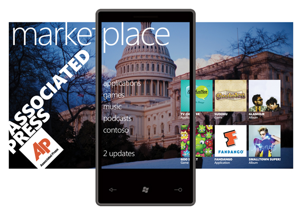
    The marketplace hub was not demoed at the launch event but since then unofficial pictures have surfaced that reveal its basic organization.  Microsoft promises that more information about apps, app development, and the marketplace will be revealed at this year’s MIX10 event next month.

    With hubs out of the way, the remainder of the tiles on the home screen include Phone, SMS, Email, Calendar, Internet Explorer, and Bing Search/Bing Maps.  Microsoft is really pushing its Bing search services on WP7S devices.  Users will be able to search specific keywords to pull up local news, information, maps, and directions.  Easy and straightforward.

    Microsoft plans on releasing WP7S during the Holiday 2010 window and they have many hardware and carrier partners lined up.  They include Dell, Garmin-Asus, HTC, HP, LG, Samsung, Sony Ericsson, and Toshiba; carrier support comes from AT&T, Deutsche Telekom AG, Orange, SFR, Sprint, Telecom Italia, Telefónica, Telstra, T-Mobile USA, Verizon Wireless and Vodafone.  Let’s just say there will be a plethora of WP7S devices later this year.  (Side note: Unlike stylus-wielding devices of the past, WP7S is focused purely on touch input and requires manufacturers to include at most only three face buttons–Back, Start, and Search.  Other hardware-specifics like required internal specs were not mentioned.)

    It all comes down to this:  Can Microsoft pull themselves out of the wreckage that was Windows Mobile and regain market (and mind) share in a highly competitive environment that Apple and Google have quickly taken over?  With Windows Phone 7 Series, Microsoft clearly defines that they finally understand that the mobile phone is very different from a PC.  In fact, during the launch event Microsoft corporate VP of Windows Phone Program Management Joe Belfiore kept reiterating, “The phone is just not a PC.”  With this knowledge, they built a brand new, visually beautiful mobile OS from the ground up, leaving out all complexities and incorporating much simplicity.  On a PC it feel natural to have various windows open to access Facebook, contacts, and Flickr.  Dealing with this mess on a small mobile device does not make sense, so Microsoft came up with an extremely intuitive way to aggregate all this information into live tiles and interactive hubs, making it very easy to see and respond to your friends and family.  Many questions remain; for instance, we still don’t know much about the marketplace and app development, and overall developer input.  From the looks of it Microsoft will put devs front and center stage, giving them access to create smart apps that will supplement the 7 Series experience.  If they learned anything from Apple and the iPhone, app existence and support is crucial for a mobile OS to succeed in today’s cell phone industry.  But with a company whose CEO is famed for screaming “Developers, Developers, Developers,” I have no doubt Microsoft will come out victorious as a worthy competitive force in the mobile space.

    Check out the gallery below for additional UI shots.  Look after the break for a bunch WP7S-related videos; they include a quick features tour, a 20 minute demo, and the streamed launch event.  You’ll also find the official press release there, too.


    Continue reading Microsoft unveils Windows Phone 7 Series

    Concept vid reveals what Google Chrome tablet may look like

    Watch out, iPad.  Google Chrome OS-inspired tablets are on the way and they are (conceptually) looking real good.  On Monday Glenn Murphy, Google Chrome’s designer, posted this UI concept video and a handful of stills on Google’s Chromium site.  Though it’s only a mockup of sorts, it proves the Google is working hard to make Google Chrome OS (and devices they will eventually run on) a fully functional, multi-tasking beast of an experience.  Since Chrome OS is at least one year away from deployment, this is essentially Google showing us how they are experimenting with several different UI manipulation techniques and appearences.

    [Via TheChromeSource; Gizmodo]

    Nokia unveils a revamped Symbian user interface

    Nokia, Nokia, Nokia.  My first phone was a Nokia.  Granted, it was what they now call a “dumbphone.”  It made calls and sent texts on a colorless screen.  Ever since then I haven’t been a big supporter of the cell phone manufacturer.  Though their modern devices are very sleek and quite beautiful, their user interface is very clunky and not very intuitive.  Think of it as anti-iPhone OS, if you will.  It takes many clicks to get to a simple destination, etc.

    This past week Nokia surprised us with a peek into their future user interface that promises to be three times faster than current Nokia Symbian OS devices and much more user friendly.  In fact, Nokia CEO Olli-Pekka Kallasvuo calls the new experience “magical.”  Nokia just might be able to pull this off because they finally understand that their problem lies in the user interface, not the Symbian OS.  Skeptics might advise Nokia to start from scratch but this would be wasteful; the Symbian OS structure has good intentions, it’s just been the way it relays information via the complicated no good user interface that has had users frustrated.

    In addition to this major software upgrade coming sometime next year, Nokia also promises new devices with multitouch support on “large capacitive displays.”

    Check out the gallery below for some screenshots of the new UI and be sure to look after the break for a video of the announcement and a simulated guided tour.

    [Via Engadget]

    Continue reading Nokia unveils a revamped Symbian user interface