Tag Archives: social networking

New changes coming to Facebook: the News Feed gets a “clutter-free” redesign

Heads up, Facebookers; there’s a new design update coming to the ubiquitous social networking site. Before it lands in your lap, get a quick overview of what to expect right here, right now.

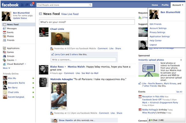
After overhauling profile pages and search, Facebook’s next task is to revamp the News Feed by reducing clutter and making the site’s main portal even more personal. The site promises “you [will] see all the stories you saw in your News Feed before, but with a fresh new look.” Each story (or post) that your friends share will show up in your News Feed will be highlighted in new ways to make content discovery easier; for example, photos, news articles, maps, and events will appear larger and brighter and more colorful and vibrant. Also new is the addition of several feeds users can choose from. There’s a new drop-down menu in News Feed that allows you to dig deeper into specific content your friends are sharing. For example, the Photos feed filters out everything except for the photos your friends are posting; the Music feed tells you what your friends are listening to and provides you information about the artists you like; and the Following feed will show you the latest news from the Pages you like and the people you follow. Mark Zuckerberg says the enhanced News Feed aims to “give everyone in the world the best personalized newspaper we can.”

The new and improved News Feed is inspired by Facebook’s mobile presence. For example, the left-hand menu that users are used to exposing with a flick from the left-hand side of a tablet or smartphone’s screen will soon be accessible in desktop browsers. Also, users will have the ability to jump right to the top of News Feed whenever new stories trickle in. The main reason for porting over these mobile functions is to unify the overall Facebook experience across all devices. The “same clean look” will soon be present on our phones, tablets, and desktop browsers.

When is “soon” exactly? Facebook isn’t providing a hard date for the switchover, but the new News Feed will slowly roll out over the coming weeks on web and mobile, so says the company. If you’re itching to get your hands on the new design, you can join the feature’s waiting list right here; that site will also give you a visual rundown of it all. Facebook employees discuss the inspiration and vision for the News Feed redesign in a brief video embedded after the break.

[Via Facebook 1, 2] Continue reading New changes coming to Facebook: the News Feed gets a “clutter-free” redesign

The new Facebook profile page design put to good use

Facebook gave profile pages a new look, and an employee from the Stinson Design agency quickly figured out how to create the coolest profile, period.  I believe it was French artist Alexandre Oudin who figured out how to visually express himself in this manner first, and the Stinson man ramped it up with the embedded YouTube video.  Look after the break to see Oudin’s profile page. Continue reading The new Facebook profile page design put to good use

Your Facebook profile page is about to receive yet another facelift

Another day, another Facebook revamp–am I right?  Though most people love to share their gripes about Facebook’s incessant need to change the way it looks, this particular change to our profile pages is actually (and I can’t believe I’m saying this) a good one.  Read on to find out why.

When you receive the profile page update and head over to your page, the first change you’ll notice is up top where your name is located.  Tabs are gone (they’ve been moved to the left-side pane, but more on that later) and under your name now you’ll find “a quick summary of who you are”, as Facebook so eloquently describes it.  What looks like a jumble of words at first is actually a list of key information pertaining to you.  For example, if you provide info. like your relationship status, where you go to school and what you’re studying, where you live, where you’re originally from, where you work, what languages you speak, and your birthday–all of this will be listed under your name and viewable by friends.  Directly beneath this “about me” section is a collection of recently tagged photos featuring you.  Keep in mind these highlighted photos are static; you cannot change the order of them.  All you can do is tap a small “x” to hide a particular recent photo and it will be replace by the next most recent tagged photo. Pretty cool way to “show what you’ve been up to lately”, I guess. Continue reading Your Facebook profile page is about to receive yet another facelift

Twitter intros push notifications for @mentions

This week Twitter introduced a neat new feature for mobile users: push notifications for @mentions.  Whenever you are mentioned in the Twittersphere you can make it so that you receive a text message or push notification from the Twitter app so that you’re instantly notified about it.  The push notification part only works with the latest version of Twitter for iPhone, for now.  Twitter is also bringing push notifications for Messages to Twitter for iPhone, a feature that Blackberry users have already been privy to.  To enable these new notifications, tweak your settings at twitter.com/devices.  Twitter says they’re working on bringing these new slate of features to Android and Windows Phone 7 users soon.

[Via TwitterBlog]

Facebook Places ready to share your location with friends on the iPhone

Similar to Foursquare, Facebook Places gives you the ability to share your location in the world with friends and view your friends’ location.  “Checking in” and sharing your location is simple:

Go to Places on the iPhone application or touch.facebook.com site and then tap the “Check In” button. You’ll see a list of places near you. Choose the place that matches where you are. If it’s not on the list, search for it or add it. After checking in, your check-in will create a story in your friends’ News Feeds and show up in the Recent Activity section on the page for that place.

You can even “tag” friends that are with you, just as you can tag a friend in a status update or photo.  You can also post an update along with your check-in to tell people more about what you are doing.  The “People Here Now” section reveals a list of nearby Facebook users, whether they are “friends” or not.  People will only show up in this list if they are checked into the same location as you.

Privacy concerns are an ongoing issue at Facebook HQ, so they made sure to highlight ways to tweak Places options.  The default setting shares your location and previously tagged locations with friends only; you have to option to change the master privacy control to “Everyone” if you like.  You also have the option whether or not to allow your friends to check you in to places.  If you let them do so, you will receive notification every time you are checked into a place.  You can always remove yourself from the places you’ve been checked or tagged into, just as you can remove your name from a tagged photo.  Want to learn more about controlling your privacy with Places?  Watch this helpful and informative video from Lifehacker that goes through the motions step-by-step.

Facebook Places is only available on the iPhone in the US.  In order to access the new feature you must download the free update for the Facebook app.  Along with Places, version 3.2 brings background photo and video uploads (for iOS4 users), some visual and loading enhancements, and various bug fixes.  Got an Android and Blackberry device?  Point your browser to touch.facebook.com to access an HTML 5 version of Places to join the fun.  Facebook is working on bring Places to other mobile devices and more countries.  They have opened up a Places API for third party developers like Foursquare, Gowalla, and Yelp to use in their respective services.

[Via Facebook; Engadget]

Twitter rolls out “Suggestions for You”

So you have a Twitter account and you follow your friends and a handful of celebrities.  What if I told you there was a way to follow even more people (and potentially gain more followers) who share similar interests as you?  A new feature called “Suggestions for You” now located in the Find People section does just that!  The Twitter relevance team has discovered a way to harness an algorithm that can “suggest people you don’t currently follow that you may find interesting.”  Factors including people you follow and the people they follow are taken into considertation when you use the new tool.  Login to your Twitter account and see what’s suggested to you.  If you happen to find someone you’re interested in following, click “Follow”; if the results include people you’re not interested in following, click hide and the tool will remember not to suggest those persons again.

[Via TwitterBlog]

Microsoft Kin: the device for “Generation Upload”

On Monday Microsoft finally lifted the covers off ancient rumored devices dubbed “Microsoft Pink” by introducing their next foray into the mobile space called Microsoft Kin.  Microsoft recently aquired Danger, the company behind the Sidekick; created with Sharp, the Kin devices are essentially next-generation Sidekicks.  At its core, and well all around it, Kin is a social networking phone aimed at tweens.  Microsoft is calling its target market “Generation Upload”, 15-30 year olds who are all about chatting, texting, taking and sharing photos, and constantly updating their favorite social networks like Facebook and Twitter.  Note that Kin is not a smartphone; smart dumbphone is more like it.  Although it’s built upon Windows Phone 7 and shares similar UI aesthetics, it can’t run apps and it’s closed off to many other WP7 features like Xbox Live.  This is all by design, really, since Microsoft is really pushing it strcitly as a social networking device.  Kin contains two family members, Kin One and Kin Two.  Both devices contain three unique features: Kin Loop, Kin Spot, and Kin Studio.

Kin Loop: This is your home screen.  It’s the place where all your social network content gets aggregated and displayed.  Loop aggregates information from four selected services: Facebook, Twitter, MySpace, and Windows Live.  Information is updated in real time (well, every fifteen minutes unless you manually hit refresh).  So what you need to understand is this: the device does not run apps for these services; they live on the phone at all times.  Your profile picture and current status is visible at the top of the screen.  The rest of Loop is covered in recently updated statuses from the friends you converse with most often.  If you want to delve deeper into their page, simply tap their picture and you’ll be transported to their standard profile page.

Kin Spot: There’s a small green spot located at the bottom center of the screen at all times.  This dot allows you to collate all kinds of stuff and share it all with your friends.  For example, if there’s a picture, video website, status update, or map you want to share with one of your contacts, simply drag and drop the content into Spot and you’re one tap away from sending it off to your friends.  Enter Spot by tapping it and select the contact and content you want to share.  Content can be shared over SMS, email, or social networks.

Kin Studio: This is where all your device’s content is stored online.  Everything that you have on your Kin (contacts, pictures, videos, etc.) is backed up to “the cloud.”  In this case the cloud is Kin Studio, a website based on Silverlight that can be accessed on any computer.  So if you lose your Kin, all the data that’s on it continues to thrive online at Studio.  Also, Studio makes for a great way to watch and enjoy your Kin’s content on a larger display.  Studio’s UI is impressive; it features a visual timeline and supports geotagging in a map, allowing you to pinpoint exactly when, say, a photo was taken, and where it was taken, respectively.  It’s a very seamless experience; if you update something in Studio (for example, add a video), the change will take effect on your Kin device, and vice versa.

Kin also comes loaded with a custom IE web browser.  The display is capacitive with multitouch support, enabling pinch-to-zoom in the browser, but there is no Flash or Silverlight functionality.  Also included is a fully functional Zune player (hrm, minus Zune gaming), allowing for music,video, and radio playback.  Zune on Kin will provide the same experience found on Zune HD players and (soon) WP7 devices.  You can stream music over WiFi and 3G and there’s full support for Zune Pass, meaning you will always have access to your entire Zune library.  For Mac users, Microsoft will be providing software to sideload your iTunes music and iPhoto pictures to a Kin device.  Note, this is not a Zune client for Mac, it just a way to get a Mac user’s content from Mac to Kin; no Zune Marketplace access for you!  Now let’s distinguish between the two members of the family. Continue reading Microsoft Kin: the device for “Generation Upload”

Twitter homepage gets a refresh

[homepage-screen.png]

Today Twitter pushed out a redesigned homepage.  It’s definitely more effective than previous implementations due to its friendly nature that will likely appeal to non-Twitter users who are looking to find out more about the community.  Trending topics and hashtags scroll along the top; what’s prominent now are the “see who’s here” and “top tweets” sections.  These sections give visitors a sense of who is adding to the conversation and what‘s being talked about in a bit more detail.  Twitter explains:

With the new design, we’re intentionally featuring more dynamic content on the front page, revealing a sample of who’s here, what folks are tweeting about, and the big topics that they’re discussing. The homepage now features a set of algorithmically-selected top tweets that automatically appear every few seconds. It also highlights a random sampling of suggested sources; hover over any of them to see a profile summary and their latest tweet. Trending topics now scroll across the page, allowing us to present a large set of trends using little page real estate. Hovering over some of these trends will show a description explaining why the keyword is (or has recently been) popular.

Now if there was only a way to get rid of all things Justin Beiber.

[Via TwitterBlog]

Google responds to user feedback, makes Buzz a bit more private

[new_Buzz_startup.png]

As soon as the announcement and release of Google Buzz hit the masses, users quickly recognized a “security flaw” in the service.  Google shares the final diagnosis like this: “In particular there’s been concern from some people who thought their contacts were being made public without their knowledge (in particular the lists of people they follow, and the people following them). In addition, others felt they had too little control over who could follow them and were upset that they lacked the ability to block people who didn’t yet have public profiles from following them.”  So what have they done to combat contact privacy issues?

1. More visible option to not show followers/people you follow on your public profile

2. Ability to block anyone who starts following you

3. More clarity on which of your followers/people you follow can appear on your public profile

In addition to these changes, Google has also revamped the “start-up experience,” the initial ‘Welcome to Google Buzz’ screen.  An auto-suggest model replaces the auto-follow model, allowing the user to pick and choose who they want to follow instead of Buzz automatically adding their contacts and chat buddies to their follow list.  Also, “If you don’t want to share the lists of people who are following you and people you are following publicly on your profile, you can opt out at any time from the [new and improved] edit profile page.”  Some other changes include: “Buzz will no longer connect your public Picasa Web Albums and Google Reader shared items automatically” and now there’s a Buzz tab in GMail Settings where “you’ll be able to hide Buzz from Gmail or disable it completely.”  All these changes in its first week, it’s quite impressive; Google is definitely taking to heart loud user feedback.  And all of this seems to be resulting in a better Buzz experience so far.

[Via GoogleBlog, here & here]

Google Buzz is Twitter on steroids

Google’s latest foray into the social networking business has everyone atwitter; so what’s all the buzz about?  Google Buzz is a new way to share updates with friends.  It goes beyond the standard “status update” from Facebook and breaks free from a 140-character tweet from Twitter, allowing you to quickly and easily share content across the Internet.  Buzz is built into Gmail.  If you have a Gmail account you are already set up for the service; your current list of contacts and people you chat with the most automatically become your followers.  That last word strikes a familiar chord, doesn’t it?  Buzz is very similar to Twitter; you follow people, people follow you, you post updates, and so on.  What makes it different (and so much more expansive) is that there’s no character limit and the means of interaction with others is much more fluid.  It fosters greater interaction with the ability to share links, photos, and video.  YouTube videos can be embedded right into posts, along with pictures that can be viewed in full size and resolution.  Besides sharing your own information, you will be alerted about new posts from followers and their group of followers; Buzz recommends posts from people you’re not directly following to promote a growing community of new friends and acquaintances.  @-responses are supported, allowing you to specifically address a friend’s post.  You also have the option to connect Buzz to other accounts like Picasa, Flickr, Google Reader, and Twitter and spread your posts, pictures, and breaking news that way.  And don’t worry–you have the option to keep things private among friends or public with the Buzz community.

Google Buzz should be fully integrated into everyone’s Gmail account by now.  You’ll notice a new small tab located under the Inbox tab labeled Buzz.  Now what if you’re away from the computer and still want to buzz about stuff?  Google’s created Buzz for mobile and it’s got some intruiging features.  What’s unique about posting on your phone is that Buzz uses location-based services to pinpoint exactly where you are when you post something, allowing your followers to find you on a map.  Tagged locations do away with long/lat numbers and display the actual names of places instead.  There are four ways to access Google Buzz on your cell phone.  (1) On an iPhone or Android phone go to buzz.google.com to access a Buzz web app; it has two views: “‘Following’ view shows buzz from the people you follow, just like Google Buzz in your Gmail; ‘Nearby’ view shows public buzz that has been tagged with a location near you, and might be from people you don’t follow. From Nearby view, you can also select a specific place from the list of nearby places and view posts attached to that place.”  (2) Buzz on Google Maps for mobile, available only on Android phones, adds a new Buzz layer to the Maps application and “allows you to see buzz near you or anywhere on the map. You can post public buzz directly from the layer, and even attach a photo from your phone.”  (3) Buzz Shortcut from Google.com allows any cell phone with a browser to access Buzz. (4) The Google Voice application, available on Android phones in the quick search widget and on iPhones in the Google Mobile App, “allows you to post buzz without typing anything. Just say ‘post buzz,’ followed by whatever you’d like to post.”

Is Google Buzz going to be a success?  Will it catch on with the masses a la Facebook and Twitter?  Buzz surely has the potential to replace Twitter as a social networking tool.  At its core, Buzz is all about “start[ing] conversations about the things you find interesting” and it does it pretty well already.  I agree with Mashable when they say “if Google Wave is the future, Google Buzz is the present.”  The Google Wave beta made heads tilt in confusion, and Google thinks Buzz is an appropriate stepping stone to it.  Buzz goes beyond email and IM but it does not overstep its boundaries (aka the craziness that is Wave).  Thing is, Buzz does not feel like a transition service because it comes off as Twitter on steroids–something we’re used to, just beefier.  Buzz is already making noise; today Facebook and AOL have joined forces to allow IM users to chat with Facebook friends over the AIM client.  And Twitter should be scared, too; their 140-character limit and lack of expanding services may start to wear thin with Buzz lurking around the corner.  A potential issue for some may arise in the fact that Buzz requires Gmail sign up but to these naysayers I say so what?  Gmail is the best Internet email client out there anyway; now’s a better time than ever to jump on the bandwagon and join the Gmail community.  Because that’s what it’s becoming thanks to Buzz–one giant place to share the things you find interesting with others.

Google Buzz in Gmail, for mobile, and the launch event can be found in video form after the break, you know, if you’re into that stuff.

[Via GoogleBlog, here & here]

Continue reading Google Buzz is Twitter on steroids

Facebook gets a redesign; Twitter is updated

On Friday Facebook received a facelift; what else is new, right?!  It feels like the Facebook devs are constantly updating the site’s user interface.  Though having to re-learn how to navigate the site every few months is an annoying task, you have to remember it’s all being done to make the experience more streamlined and faster to get around.  So what does this latest redesign bring with it?  The Top Menu is the area where you’ll find your newest notifications, friend requests, and inbox messages in drop-down menu form.  The Left Menu brings together Messages, Events, Photos, and Friends all in one space.  An extension of your Friends List is also found here; it lists the people you chat with most and can be expanded to its usual spot in the bottom right-hand corner.  There have also been updates to the Applications and Games dashboards, making it easier to discover and play new apps.  The center of the page prominently features your News Feed.  All in all, since the redesign only affected the home page (your profile and friend’s profiles look and function the same) there isn’t much to re-learn.  In fact, I find the new look freshing and definitely a step up from their recent upgrades.  But that’s what it’s all about, right?  (Side note: This redesign comes on the heels of Facebook’s 6th birthday.)

Twitter’s update is not as drastic but it still brings a few welcome features.  Hovercards give users a new way to access profile information without having to leave the homepage to visit someone else’s profile page.  Twitter Spokesperson Jenna Sampson explains: “Hovercards are cards which appear when you hover over a username or avatar.  The cards display additional information about the person and allow you to interact with them while staying within the context of your page.”  Hovercards reveal the person’s name, profile information, location, and whether or not you follow the person.  You also get an options panel with follow, block, mention, or report buttons.  Less clicks and page redirections are the result.  A welcome update indeed.  Twitter is also giving users the ability to narrow the range of the Trending Topics list.  Instead of being forced into watching worldwide trending news, users can specify their country or US city.  They are currently working on adding more locations to the list.

For those of you who have not received the Facebook or Twitter updates yet there’s no need to worry.  It takes time for such updates to reach all users.  (I was one of the first to receive the Facebook redesign, but I have yet to play around with Hovercards in Twitter.)

[Via FacebookBlog; Mashable]

Facebook lite

Facebook lite is basically a stripped down version of it’s more encompassing counterpart.  Facebook says, “Facebook Lite is a faster, simpler way to keep in touch with your friends. If you like it, you may choose to use it instead of the regular Facebook.”  By simplerthey mean dumbed down.  The site is literally a bare-bones version of Facebook that will allow older folks and younger kids (why are they even registered on Facebook, anyway) to join in on the fun that is social networking and such.  The site is easier to navigate with larger buttons and less clutter.  However, features are missing from the standard Facebook website and it’s up to you to decide if it’s worth doing away with functionality for simplicity.  Check it out for yourself at http://lite.facebook.com/.

[Via CSMonitor]