Tag Archives: UI

Microsoft rolls out revamped Xbox One user interface

On November 12, Microsoft rolled out a new Xbox dashboard update and it brings a totally revamped user interface to the surface along with backwards compatibility. Microsoft’s been keen on doling out monthly updates to its home video games console/entertainment hub, and this latest one is its boldest yet.

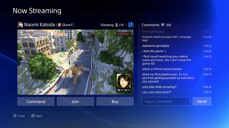
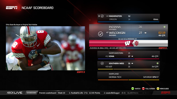
Xbox One now features a UI based on Windows 10 with a focus on speed, efficiency, and social interactions. Along the top you’ll notice four sections: Home, Community, OneGuide, and Store. Inside Home, you’re presented with your most recently used games and apps, and your pinned games and apps live below them under a category titled “My stuff.” Along the left-hand side there’s a new Guide pane that presents quick access to Friends, Parties, Messages, Notifications, Settings, and app-snapping functionality. From here you can also sign-in and manage users. This pane can be accessed at anytime (read: inside games and apps) by double-tapping the Xbox button on your controller. Inside Community, you’re presented with an activity feed filled with unlocked achievements, screenshots, and clips shared by your friends. Here you can interact with them with likes, comments, and sharing. Above the feed, there are buttons to refresh it and dive into your Game DVR. Next to the feed you’ll see what’s trending on Xbox Live with quick access to content from sources like Xbox and YouTube. A new OneGuide section features trending entertainment offerings across TV, movies, and sports. App channels from content providers like Amazon and Crunchyroll provide quick access to preferred programming. Last, there’s Store; when this section is selected it auto-expands to reveal sub-sections Games, Apps, Movies & TV, and Music. These redesigned storefronts highlight popular media and make it easy to discover and search for content thanks to large thumbnails and detailed splash screens.

In addition to the faster, streamlined UI, the “New Xbox One Experience” brings with it Xbox 360 backwards compatibility, a feature that gamers have been clamoring for ever since launch. Microsoft is launching the initiative with 104 Xbox 360 titles on Xbox One, and it promises more to come as soon as December. You can view the complete Backwards Compatibility Game Library right here, and you’ll want to bookmark that link to stay updated about future additions. Oh, and it’s been confirmed that multiplayer-enabled games will support cross-play between the 360 and the One–how cool is that?!

Kinect owners may notice that motion-activated gestures are no longer supported by the dashboard with this update. There’s no need to fret, though. An even more natural way to navigate the system is coming and that’s Cortana integration. Soon you’ll be able to call up Microsoft’s digital assistant to perform even more advanced commands; finding out if a friend is online, inviting a friend to a party, and recording and sharing gameplay to your activity feed will be handled swiftly by Cortana in the near future. Also coming in 2016 is DVR functionality, so you can look out for that, too.

I’ve spent some time with the updated dash and I’m happy to report that it’s a breeze to use. The redesigned Home, Community, OneGuide, and Store sections present consolidated and streamlined portals into the best of what Xbox has to offer. Accessing your content and sharing your achievements are simple affairs. Peering into your Xbox Live community (Friends list, Parties, Messages, etc.) is made much more efficient thanks to the new Guide. Your favorite Xbox 360 titles are injected with new life on Xbox One; in addition to emulating them on your console, you can also take advantage of Xbox Live’s latest features including taking screenshots, recording Game DVR clips, and even game streaming to Windows 10 devices. In an effort to make Xbox One an easily accessible destination to play games with friends and consume streaming entertainment, Microsoft succeeded with flying colors with the New Xbox One Experience.

In case you haven’t automatically received the NXOE yet, you can manually download and install it inside Settings. And if you’ve got time to kill, jump after the break to preview the nooks and crannies of the new UI with Xbox’s Major Nelson. Continue reading Microsoft rolls out revamped Xbox One user interface

Xbox and PlayStation at Gamescom 2014

Gamescom is a video games trade show–like E3, except for the that fact that it takes place in Europe (in Cologne, Germany to be precise) and it attracts a much, much larger crowd of attendees including members of the press and game developers. And just like they did at Los Angeles’ E3 in June, console makers Microsoft and Sony held press events revealing new titles, providing updates on previously announced ones, and showing off new system features. For the latest on the games, I recommend you visit Joystiq. This post will mostly focus on software updates coming to the Xbox One and PS4, as well as new hardware options revealed. For the full scoop, jump after the break. Continue reading Xbox and PlayStation at Gamescom 2014

PlayStation 4 launches today

The next generation of gaming has finally arrived. Sony launches PlayStation 4 today, November 15. Whether you preordered the sleek, black console months ago or if you’re waiting on line at a retailer, the PS4 is ready for action right out of the box. However, you should note that the system requires a Day 1 update that activates many features such as the ability to log into the PlayStation Network and play Blu-ray movies; so make sure your Internet connection is running smoothly! Also, don’t forget that Sony has pushed out a PlayStation App available for free in the iTunes App Store and Google Play Store; it’s similar to Microsoft’s Xbox app in that it allows you to control the console’s menus, view your profile and trophies, and receive game notifications and invitations. One cool feature is that you can browse the PS Store on the go, download a full game and have it pushed to your PS4 so it’s ready to play when you get home.

A revealing video sits after the break. We’ve seen bits and pieces of PS4’s user interface, but now on launch day Sony is ready to dive in and show off some of the UI’s nooks and crannies. The nine minute clip previews the PlayStation Dynamic Menu (which replaces PS3’s Xross Media Bar) as well as a redesigned PlayStation Store.

So what are you waiting for? Greatness awaits.

Update: Two days after the PS4’s launch date, the company announced that it sold 1 million units during the first 24 hours after it became available on November 15 in the United States and Canada.

“PS4 was designed with an unwavering commitment to gamers, and we are thrilled that consumer reaction has been so phenomenal,” said Andrew House, President and Group CEO at Sony Computer Entertainment. “Sales remain very strong in North America, and we expect continued enthusiasm as we launch the PlayStation 4 in Europe and Latin America on November 29. We are extremely grateful for the passion of PlayStation fans and thank them for their continued support.” Continue reading PlayStation 4 launches today

Microsoft demonstrates Xbox One user interface ahead of launch

Microsoft has been pretty coy about showing off Xbox One’s user interface…until now, that is. Xbox’s Yusuf Mehdi and Marc Whitten demonstrate the One’s UI and its speedy multitasking prowess in the 12-minute video embedded above.

They mostly demonstrate features we’re already aware of, but seeing truly is believing in this case. Sit down in front of your Xbox One-equipped TV and Kinect will sense your presence, recognize you, and automatically sign you into your Xbox Live account. If your buddy’s with you too, no problem; Xbox will sign both of you in and you can switch between your personalize dashboard and your friend’s simply by saying “Xbox, show my stuff.”

The One’s home screen is pretty straightforward. The middle, main section is called Home and there is the space that shows you your most recent live session, whether that may be a game or an app. To the left of Home is Pins; this is a customizable space where you can pin and save your favorite and most frequently used apps and content for easy access. And to the right of Home is Store; this space is divided into various storefronts such as Games, Movies & TV, Music, and Apps.

Multitasking on Xbox One, or jumping in and out of games and apps, is truly a breeze. In this demo, Yusuf and Marc are playing Forza Motorsport 5. Say “Xbox, go to Netflix” and the system will automatically pause the game and jump into the Netflix app. Say “Xbox, return to Forza Motorsport 5” and you’ll jump back into the game exactly where you had left off. It’s just as easy to switch to Internet Explorer, Hulu Plus, and any other app you might have installed on your console.

Also discussed are the advantages of having your games system tied to your cable box. With the One’s HDMI IN port you can hook your TV feed into the Xbox and browse and watch live TV through the system. So, when you’re watching TV now you receive Xbox notifications and jump directly into a game when an invite is presented. You may also receive a Skype call when you’re watching TV and you just as easily pause your programming to initiate a video chat. Skype on Xbox One boasts a 1080p HD widescreen picture and Kinect will smartly track your movements as you move around your living space during a conversation.

Lastly, two new features of Xbox Live are demonstrated here. With Game DVR, gamers can record their gameplay, edit it and share it with friends via the Upload Studio app. You can even select picture-in-picture mode which will record your gameplay as well as instruct Kinect to record you and your narration as you play. With One Guide, you can browse your TV channel lineup by saying things like “Xbox, what’s on HBO” or “Xbox, what’s on ESPN.” You can also create customized favorites lists within One Guide with your apps; for example you can make it easy to browse Hulu Plus’ latest offerings right inside One Guide without having to jump into the app itself.

Side note: Speaking of digital entertainment apps, Microsoft has announced the full list of said apps that will be available on Xbox One at launch and you’ll find the full list after the break.

But words can only say so much. Hit play and discover just how fast and intuitive the new Xbox really is. Xbox One hits the market in just 12 days on November 22.

Update: Yusuf is back to demo another Xbox One feature not covered in the extensive video above. It’s called Snap and it allows you to “snap” or pin an app to your screen while you’re doing something else. For example, while you’re playing Forza you can say “Xbox, snap Internet Explorer” to pull up the browser  and view a website while you’re playing the game. You can even say “Xbox, snap TV” and you can watch live TV while you’re racing. It’s multitasking for the hyper-active generation. Watch it in action after the break. Continue reading Microsoft demonstrates Xbox One user interface ahead of launch

A Google Glass tutorial shows off the stock UI

Google Glass is starting to ship out to key members of the press who attended last year’s Google I/O, developers, and winners of the #IfIHadGlass contest. If you aren’t included in any of these precious categories, here’s a little something to keep you occupied. Google has released a how-to video for their futuristic wearable technology and it brings you closer to the sleek hardware and the Android-powered user interface. Memorize the “getting started” clip above so that you’ll be ready to interact with your Glass when Google eventually decides to open its new product category to the masses.

Sony outs PS4 UI in system and mobile screenshots

During the unveiling of PlayStation 4 last month, Sony briefly glimpsed at what the next-gen console’s user interface will look like this holiday season. Since then, however, a handful of images surfaced on the ‘Net giving gamers an extended look at the PS4’s UI both on the system and on mobile devices. Player profiles, the Share portal, game streaming powered by Ustream, and other menus with a social aspects baked in are all previewed. So without further ado, a gallery filled with shiny screenshots awaits.

[Via Engadget]

Google Glass, future wearable technology, exposes its simple user interface (new video & pictures inside)

This week Google launched a new online portal that sheds more light on its wearable technology previously labeled Project Glass, now called Google Glass. The search giant and Android maker first unveiled Glass in April 2012 to much fanfare in the tech crowd. Later in July at Google I/O 2012 the company brought it back on stage to keep the hype going. Pictures were posted and some specs floated around, but Google kept its intriguing concept still truly under wraps. And although it still hasn’t announced a hard release date or price, Google has officially lifted the veil on what exactly Glass can do in its current stage of production and the company is giving ordinary people the chance to experience Glass first-hand this year. Continue reading Google Glass, future wearable technology, exposes its simple user interface (new video & pictures inside)

Google+ goes under the knife to provide a more streamlined experience

The next time you login to Google’s social network things will look entirely different. That’s because the search giant has gone ahead and updated Google+’s interface practically from head to toe. You’ll notice that the static icons that used to live up top have been replace by a dynamic ribbon of applications that are now located to the left. Apps can be organized to your liking and quick actions can be accessed simply by hovering your cursor over them. Your list of Google+ and Gmail Chat buddies can be exposed to the right in a move that mimics Facebook’s sidebar. Other big changes include the Explore app that shows you “what’s hot” and trending on the network and Hangouts now has its very own page dedicated to informing you about open Hangouts you might be interested in joining. The new version of Google+ is currently rolling out to all members of Google’s social spot, so log in and explore the alterations and new additions today. After the break there’s a video highlighting it all.

[Via Google] Continue reading Google+ goes under the knife to provide a more streamlined experience

Twitter gets a new look, again

On Thursday Twitter announced that it’s rolling out another new look for its homepage. This time around, the desktop and mobile experiences are getting simpler and streamlined. (New) New Twitter is organized into four sections: Home, Connect, Discover, and Me. Let’s take a brief tour…

Home is home to your personal collection of tweets. The desktop version is organized into two columns. To the left there’s your personal info including your name, profile picture, your number of tweets, who you’re following, and your followers; there’s also a link to your profile page and a way to quickly compose and send out a tweet. Underneath that you’ll find follower suggestions and the trending topics list. To the right there’s the familiar list of incoming tweets from the people you follow. The new interface allows tweets that are attached with images and videos to expand so you can easily explore embedded media. Replying, retweeting, and favoriting tweets are all just one hover and click away.

Connect acts as a hub very much like the Activity Feed of the old Twitter. It’s the place where you’ll see who has followed or mentioned you, retweeted or favorited one of your tweets. Tweets are organized by Interactions and Mentions. A search bar sits at the top and you can use it to find and discover people by entering their @username or full name.

Discover highlights trending topics and stories that are being talked about on the social network. This section is organized like this: Stories, Activity, Who to follow, Find friends, and Browse categories. Stories that are shown to you are based on recent popularity as well as your connections, location and language. Activity shows everything your connections do related to the accounts that they follow. See who else your connections follow, their lists and what Tweets they favorite, retweet or reply to most. In Discover the search bar at the top allows you to enter a hashtag or keyword to further explore a topic of your choice.

Me servers as your profile page and it can be fully customized from here. A gallery of your recently tweeted photos and videos are stored here, as are your Direct Messages.

The new Twitter design is the network’s most simplistic to date, and best of all it transfers over to the mobile space too. Whether you’re accessing Twitter from a desktop or your cell phone the experience will be nearly identical. How do you enable the new look? Easy! Download and login to the latest versions of Twitter on your iPhone or Android device and then you should be able to access the new desktop version. Twitter says they’re working on rolling it out to all users “over the next few weeks.”

[Via Twitter 1, 2]

Gmail takes a bold step forward with new look [Update: official iOS app released]

Today Google flipped the switch and transformed Gmail with a new look. It was previewed back in July and now it’s ready for primetime. The navigation panel on the left is more customizable;  you can resize the labels and chat areas depending on which section you access most often. Search has been upgraded, too. The search box up top now features a drop box with helpful options that should make finding exactly what you’re looking for easier and faster. You can also create filters from search queries. Emails have been aesthetically transformed to look like streamlined conversations. Profiles pictures for your contacts show up inside emails and unneccesary text has been stripped out of view making reading a conversation a better experience. In addition, Google has figured out a way to make the Gmail window fit your screen perfectly; the spacing between elements on the screen will automatically change based on the kind of display you’re using. In the settings menu, you can play around with display density and manually select “comfortable,” “cozy,” and “compact” views. Last, the Gmail team has added high resolution themes to the mix. They say most of the popular themes have been upgraded to HD, so the switch on your end should happen automatically. The new look has rolled out to everyone today; to enable it simply click the “Switch to the new look” link located at the bottom right in Gmail. There’s a brief video highlighting these changes after the break.

Update (11/3): Today Google finally released an official Gmail app for iOS devices. Google says they’ve “combined your favorite features from the Gmail mobile web app and iOS into one app so you can be more productive on the go.” The Gmail app promises to bring speed, efficiency, and optimized touch input to the table. The iPad version takes advantage of the larger display, naturally. Moments after Google released the Gmail app into the wild, unfortunately, they pulled it from the App Store due to “a bug which broke notifications.” As soon as the app returns to the Store you will be notified.

Update 2 (11/16): And it’s back! Get your download on right here.

[Via GoogleBlog; GmailBlog] Continue reading Gmail takes a bold step forward with new look [Update: official iOS app released]

Facebook “improves” News Feed, Friend Lists; adds Subscribe Button and Ticker

Logged into Facebook recently? What was your reaction to the new look? Are you joining the bandwagon and hating on Zuckerberg and company for changing the ways things operate on the world’s most prolific social network yet again? Or maybe you are taking a liking to the new features just tacked onto the site. Whatever your feeling, it’s time you got used to these transformations in appearance and functionality. It’s not like you’re jumping ship and joining Google+ anytime soon (or are you?). Take my hand and let’s tour all of the “improvements” and additions Facebook integrated into the site almost overnight.

News Feed

The News Feed is no longer split up into two separate sections. Top Stories and Most Recent are now combined into one flowing, constantly updating list. Here’s how Facebook describes it: “All your news will be in a single stream with the most interesting stories featured at the top. If you haven’t visited Facebook for a while, the first things you’ll see are top photos and statuses posted while you’ve been away. They’re marked with an easy-to-spot blue corner. If you check Facebook more frequently, you’ll see the most recent stories first. Photos will also be bigger and easier to enjoy while you’re scrolling through.” Facebook considers “the most interesting stories” to be the status updates, photos, and links that are commented on most. When you see posts that interest you, there’s now an option to mark it as a “Top Story” and this is done by clicking blue corner. Tap it again and Facebook will say “We’ll try not to put more stories like this at the top of your News Feed.” In other words, you can teach Facebook what stories interest you from which friends and hide the ones that you don’t care to see. In sum, the updated News Feed will provide you with friends’ posts depending upon how frequently you visit the site.

The Subscribe Button

The new Subscribe button allows you to tweak exactly what you see in your News Feed. Facebook says you can use it to: “1. Choose what you see from people in News Feed; 2. Hear from people, even if you’re not friends; and 3. Let people hear from you, even if you’re not friends.” In your News Feed, you already see what your friends are posting; with the Subscribe button you can choose how much you see from them–“all updates,” “most updates,” and “important updates only.” Things can be broken down even further. You can decide what types of updates you see; for example, “you could see just photos from one friend, no stories about games from another, and nothing at all from someone else.” Simply hover your mouse over a story in your News Feed and a transparent arrow appears; click it to enter a drop down menu with Subscription settings. You can also subscribe to people you aren’t friends with, like musicians and political figures. If they have a Subscribe button on their profile page, click it and you will receive their public posts in your News Feed. If you want to add a Subscribe button to your profile and allow anyone to view your public posts, click here to activate it.

Friend Lists

Facebook has ripped a page from Google+’s playbook to improve the way users organize their friends. Much like Google+, Facebook has made it easier to add and place friends into specific categories, such as School and Work. “Smart lists” are created by Facebook and automatically group your friends together based on location, school, family, etc. For example, “if you list Boston College as a school you’ve attended and your friends John and Sarah do too, then you would instantly have a smart list called “Boston College” with John and Sarah on it.” Facebook has also created Close friends and Acquaintances lists; you can manage these lists yourself and place the appropriate people in them. The Restricted list is for your parents or bosses, people that you want to hide most of your content from; they will only see your Public posts. In fact, you can create as many lists as you like, edit them, and name them whatever you like. Very reminiscent of Circles, eh? Once a list is created, it will appear on the left-hand side of the webpage. When you click a list, your News Feed will show you top and recent stories only from the people in that list. Also, when you go to share a post you now have the option to share content specifically to one or more lists and only the people in them will see it. Facebook is making it easy to get your lists started. From now on when you go to add a new friend or accept a friend request, you will be prompted to add that person to a list (just like Google+ when it forces you to add a new friend to a Circle).

Ticker

In the top right corner of the webpage, directly integrated into the sidebar is a new feature called Ticker. In essence, it shows you all of your friends’ Facebook actions in real time. “Now when a friend comments, asks a question or shares something like a check in, you’ll be able to join the conversation right away. Click on anything in ticker to see the full story and chime in – without losing your place.” It’s a miniaturized version of the News Feed, and Facebook thinks it makes it easier and faster to see what your friends are up to and initiate conversations around their posts.

[Via Facebook 1, 2, 3] Continue reading Facebook “improves” News Feed, Friend Lists; adds Subscribe Button and Ticker

ESPN on Xbox LIVE gets a makeover

The ESPN app on Xbox Live is getting its first major update since it launched last summer. The dashboard can be customized to feature your favorite sports teams so fans can see a daily feed of news and highlights from those specific teams; the addition of the ESPN BottomLine keeps fans in the know with breaking news and score updates; a Mini Guide can be called up from the bottom of the screen to give fans a preview and quick access to personalized sports content; and Reminders and Live Alerts can be set. Two new features that stand out are Split Screen and Voice Control with Kinect. Fans can watch two events at once (i.e. watch ESPN3.com live events on both screens or a live event on one while catching up on ESPN.com news and highlights on the other) and they can navigate through the Content Guide, skip to the next highlight, or play, pause, and rewind plays through voice control.

Remember that access to ESPN3.com live events is only available to customers of an affiliated service provider; if you’ve got that and you’re an Xbox LIVE Gold Member you’re set! Screenshots below, demo videos and full PR after the break.

[Via Engadget; ESPN]

Continue reading ESPN on Xbox LIVE gets a makeover