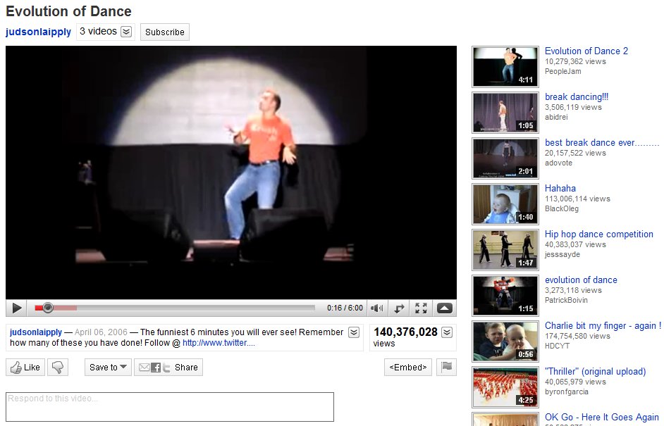
YouTube has gone ahead and given itself a makeover, pretty much making everything a whole lot more streamlined. The overall look is stripped down and clean, making the video player the most prominent part of the screen real estate. In the past, the user’s video information was placed in an expandable box to the right of the video. All of that has been move and broken up into two different place. Directly above the video player you’ll find the username link, more videos from that same user (when clicked it expands down to reveal a horizontal list of all their uploaded videos), and a subscribe button to subscribe to all of their videos. Directly below the player you’ll find the video description that expands down to show category, tags, and more information about the video. Next to the video description is the Views total; not only does it tell you the number of view the video has, but it can also be expanded down to share stats, links, and honors associated with the video. Underneath the video description you’ll find a panel of buttons called the Actions Bar. First there’s the new ratings system; a thumbs up/thumbs down model replaces the original 5 star rating system. The Save To button allows you to favorite a video or add it to one of your playlists. The Share button allows you to share the video via email, Facebook, Twitter, etc. Lastly there’s the Embed and Flag buttons, to copy the video inside another website and flag a video as inappropriate, respectively. If you happen to click on any video in a playlist, you will find the Next Up box, located in the top-right of the page. Next Up makes for a consistent viewing experience; depending on what you search, the Next Up box will queue up videos related to your search. And, if the auto-play option is turned on, the video player will automatically play the next video in the series as soon as the previous one is finished. The video player itself hasn’t really changed much. It includes the full screen and ‘make wider’ buttons, scrubbing controls with real-time time stamps, volume, and video quality options (360p to 1080p HD). Other neat updates include Closed Captioning (which can be turned on in certain videos where you find the Annotations toggle) and a cleaned up comment section.
Overall, the YouTube facelift really enhances the user experience. Everything is organized, tidied up, and looking better than ever. If it weren’t for those pesky ads, the whole thing would be downright perfect.
[Via YouTubeBlog]
Check out the youtube blog comments or better yet, check out the youtube help forums about the changes. I have yet to see ONE positive comment about the changes. Everyone despises the new design and changes. If you truly believe that this new layout enhances the user experience, you either work for Google or you never use the site yourself.