Tag Archives: makeover

Facebook redesigns profile pages with Timeline, partners with app developers to make things more social
Hot off the heels of updating the News Feed and adding the Ticker, Facebook’s Mark Zuckerberg announced more changes coming to the social network at today’s F8 developer conference.

Timeline

Your profile page is about to undergo an extreme makeover. The page is becoming wider to offer up more content at a glance and it will house three distinct sections: Cover, Stories, and Apps. Your Cover is dominated by an enlarged image, something that is separate from your profile picture and better expresses who you are. Your Cover can be personalized at any time and with any image you uploaded to Facebook. This section of the profile also shows off your About info (where you live, where you went to school, your job, your relationship status, etc.) and it also gives your friends a quick glance at your total number of friends, photos, likes, etc. Directly below that section is your Stories; this is an enhanced version of your Wall and it’s defined by an integrated Timeline. The Timeline makes it easier to highlight and go back to older posts. Up until the introduction of this new interface, the only way to see go back and see post from the past is to scroll all the way down to the bottom of your profile page and click “Older posts.” Users are forced to keep clicking that link to dig into the past. With Timeline, the past is easier to rediscover with the ability to highlight past memories that you don’t want people to forget happened so fast. All the content you ever posted on Facebook can be scrubbed through by date (month, year). And the Timeline is totally customizable; you can go back to a particular date and add events and pictures that you might have forgotten to post at the time they occurred. You can mark (or “star”) your favorite stories and these will expand to widescreen so your friends can see them more clearly. You can also remove the stories you want to hide. In addition to your Stories, the Timeline section of your profile page will also highlight apps.

Social apps

Facebook has offered apps in the past, but never like this. Zuckerberg and company have teamed with more than a handful of third-party developers to make apps more social on Facebook. Here’s an example: You’re an avid user of the new music streaming service Spotify and you’ve connected your Facebook account to your Spotify account. Since you’ve been using Spotify when it launched earlier this summer in the US, you’ve been listening to tunes and sharing what kind of music you listen to with your friends over Facebook. Today Facebook is bringing the listening and sharing experience to a whole new level. When you tell Spotify to share your listening habits to your Facebook friends, not only will they see what you are listening to but they’ll also be able to play the song directly within Facebook (granted your friends also signed up for Spotify). This will make music discovery simpler and definitely more social. And the world of social apps only begins with music. Facebook also partnered with major developers like Netflix, CNN, Kobo, and Foodily to make sharing what movies you’re watching, news and books you’re reading, and recipes you’re cooking a whole lot more engaging. The social apps you use regularly will show up in your friends’ News Feeds and Tickers and of course inside your profile page on your Timeline alongside the rest of your Stories.

In sum, Facebook wants your profile page to evolve into “the story of your life.” It will become the place where you and your friends can see what you’re all about and discover your life accomplishments as they happen. And with social apps, you and your friends will have greater access to sharing and engaging in conversation around similar interests you may never have known existed. Users tend to lambast Facebook for messing around with the interface on a regular basis, but it’s tough (at least for me) to deny the sheer amount of potential social apps have for the future of online interaction and discovery. And with Timeline, you won’t have to worry about your most exciting and interesting posts getting lost in the past. Of course, it’s tough to say how effective all of this is going to be without having played around with it. Facebook says social apps are rolling out today and the new profile design is going out to developers now and will slowly trickle out to all users soon. For now click here to view a sample “New Profile” and start getting used to the future of social networking.

[Via Facebook] Continue reading Facebook redesigns profile pages with Timeline, partners with app developers to make things more social

ESPN on Xbox LIVE gets a makeover

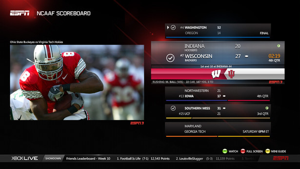
The ESPN app on Xbox Live is getting its first major update since it launched last summer. The dashboard can be customized to feature your favorite sports teams so fans can see a daily feed of news and highlights from those specific teams; the addition of the ESPN BottomLine keeps fans in the know with breaking news and score updates; a Mini Guide can be called up from the bottom of the screen to give fans a preview and quick access to personalized sports content; and Reminders and Live Alerts can be set. Two new features that stand out are Split Screen and Voice Control with Kinect. Fans can watch two events at once (i.e. watch ESPN3.com live events on both screens or a live event on one while catching up on ESPN.com news and highlights on the other) and they can navigate through the Content Guide, skip to the next highlight, or play, pause, and rewind plays through voice control.

Remember that access to ESPN3.com live events is only available to customers of an affiliated service provider; if you’ve got that and you’re an Xbox LIVE Gold Member you’re set! Screenshots below, demo videos and full PR after the break.

[Via Engadget; ESPN]

Continue reading ESPN on Xbox LIVE gets a makeover

Google gets a makeover

You can call it Exteme Makeover: Google Edition. Over the past few weeks Google has been rolling out a new look across many of their services, including the Google homepage, Gmail, Google Calendar, and YouTube. “The way people use and experience the web is evolving, and our goal is to give you a more seamless and consistent online experience—one that works no matter which Google product you’re using or what device you’re using it on,” explains Google. In a word they’re simply streamlining all their intertwined experiences, and the changes are ” founded on three key design principles: focus, elasticity and effortlessness.”

At Google‘s homepage you’ll surely notice the new black strip located across the top; the colorful logo is smaller and centered, the Search and Lucky buttons have a new hue, and the About, Privacy, and Advertising links have been moved to the bottom left-hand corner of the page. In Gmail and Calendar everything is bolder and more roomier to match the new homepage aesthetic. Design cues were certainly carried over from Google+. Google’s also experimenting with YouTube’s look; Cosmic Panda is the codename for the video player’s new sheen. YouTube is positively sleek in its new coat of paint.

Google’s homepage and Calendar changes have been rolling out to users automatically. To experience Gmail and YouTube’s new flairs you must enable it manually. In Gmail, select “Preview” and “Preview (Dense)” themes in the Themes tab in Gmail Settings; to play around with Cosmic Panda head over to this YouTube portal and click “Try it out.” Since Google’s still testing it out and awaiting customer feedback, you can revert back to the classic look at any time.

It will take time for every Google service to fall in line aesthetically with the new homepage, but there’s no denying that Google’s first wave of cosmetic changes is simply delightful and, well, downright sexy.

YouTube gets a facelift

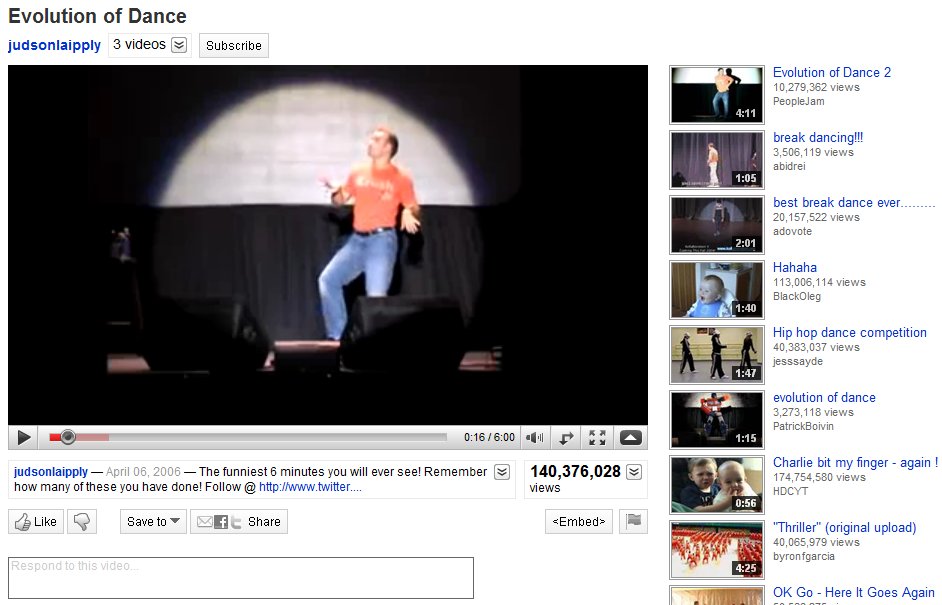
YouTube has gone ahead and given itself a makeover, pretty much making everything a whole lot more streamlined.  The overall look is stripped down and clean, making the video player the most prominent part of the screen real estate.  In the past, the user’s video information was placed in an expandable box to the right of the video.  All of that has been move and broken up into two different place.  Directly above the video player you’ll find the username link, more videos from that same user (when clicked it expands down to reveal a horizontal list of all their uploaded videos), and a subscribe button to subscribe to all of their videos.  Directly below the player you’ll find the video description that expands down to show category, tags, and more information about the video.  Next to the video description is the Views total; not only does it tell you the number of view the video has, but it can also be expanded down to share stats, links, and honors associated with the video.  Underneath the video description you’ll find a panel of buttons called the Actions Bar.  First there’s the new ratings system; a thumbs up/thumbs down model replaces the original 5 star rating system.  The Save To button allows you to favorite a video or add it to one of your playlists.  The Share button allows you to share the video via email, Facebook, Twitter, etc.  Lastly there’s the Embed and Flag buttons, to copy the video inside another website and flag a video as inappropriate, respectively.  If you happen to click on any video in a playlist, you will find the Next Up box, located in the top-right of the page.  Next Up makes for a consistent viewing experience; depending on what you search, the Next Up box will queue up videos related to your search.  And, if the auto-play option is turned on, the video player will automatically play the next video in the series as soon as the previous one is finished.  The video player itself hasn’t really changed much.  It includes the full screen and ‘make wider’ buttons, scrubbing controls with real-time time stamps, volume, and video quality options (360p to 1080p HD).  Other neat updates include Closed Captioning (which can be turned on in certain videos where you find the Annotations toggle) and a cleaned up comment section.

Overall, the YouTube facelift really enhances the user experience.  Everything is organized, tidied up, and looking better than ever.  If it weren’t for those pesky ads, the whole thing would be downright perfect.

[Via YouTubeBlog]