Tag Archives: chart

How the world searched, tweeted, and YouTube’d in 2010

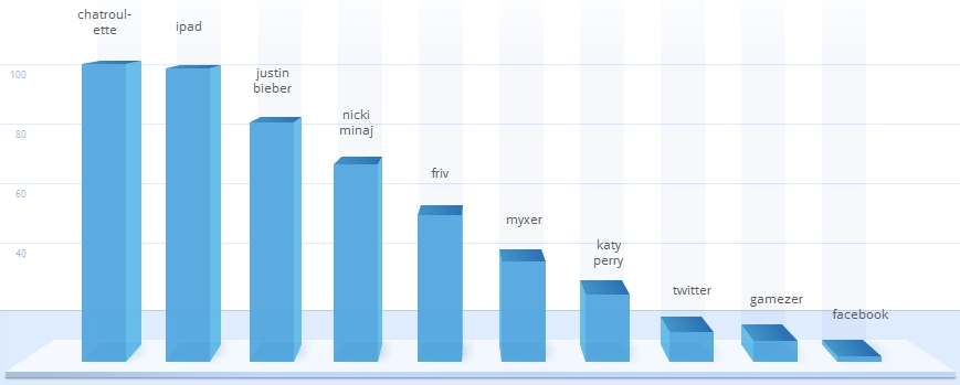
Ah 2010, what a year it has been.  What’s the best way to find out what was on everyone’s minds over the course of the past year?  By looking at the top Google searches, top Twitter trends, and most watched YouTube videos, duh!  The search giant has gone all out this year with their public Google Zeitgeist 2010.  What were this year’s hottest search terms?  Well, just look in the bar graph above!  The creepy video chat service Chatroulette took the top prize as the fastest rising query, and the rest of the list includes celebrities Justin Bieber, Nicki Minaj, Katy Perry, Apple’s iPad, game portals Friv and GameZer, ringtone maker Myxer, and social networking sites Facebook and Twitter.  Click here to browse the entire Google Zeitgeist report.  Search terms are categorized subject matter and region, and Google also put together some snazzy interactive maps to support the data analytics.

Look after the break to learn about the most popular Twitter trends and the most watched YouTube videos of 2010. Continue reading How the world searched, tweeted, and YouTube’d in 2010

Offical Windows 7 upgrade chart, are you kidding?

This is unbelievable.  It’s actually quite obnoxious.  It is the official Windows 7 upgrade chart from Microsoft.  Moving or upgrading from one OS to another is supposed to be an easy task.  One company that gets this right is Apple.  When a new version of OS X comes out, a Mac customer simply goes to a store, picks up a single copy of the new OS, and downloads it to his or her computer, hastle-free.  One company that gets it completely wrong is Microsoft.  To start things off on a bad note, Microsoft stocks the shelves with more than one copy of a new OS (usually more than 4 versions).  To make things more confusing, they create a chart like the one posted above.  An upgrade chart is supposed to be helpful and aid a PC customer in the upgrade process.  What this chart does is make things so much more confusing and aggrevating; it presses the fact that there is more than 1 single version of Windows 7 and Windows Vista and it makes things less clear with terms like “custom install” and “in-place upgrade.”  This chart contains 66 different senarios to choose from; also, it “includes an entire row dedicated to a product that doesn’t exist: Windows Vista Starter 64-bit edition (Vista Starter is available in 32-bit only)”–that’s blasphemy!

So, what is there to do?  Leave it to ZDNet’s Ed Bott to clean up the chart and make it readable.  He completed a revised and more sensible chart in about an hour.  If you are thinking about upgrading from XP or Vista to Windows 7 this October, take a look after the break for Bott’s chart.  Microsoft, get your act together!  You attempted to “wow” us with Vista, and that was a disaster (initially).  Now you are trying to pick yourself back up with the positively reviewed Windows 7.  Releasing more than one version of an OS and creating an upgrade chart that makes matters worse is bad, very bad.  A confused customer is not the end goal.  Shake it off, and let’s look forward to Windows 7 releasing without a hitch this October.

[Via Engadget; ZDNet] Continue reading Offical Windows 7 upgrade chart, are you kidding?