Today Hulu gave their video player a much needed refresh that brings with it a slightly updated look and a bunch of new features. You can watch a brief guided tour about all the updates in the video embedded above, but I’ll run through some of them here. The base video player is now 720×404 pixels large, that’s 25% more surface area than the old player. When you’re watching a video and the mouse is at rest, the player is control-free, meaning on all-screen controls and menus are hidden from view. There are new player controls that are now streamlined across all videos: normal player, fullscreen player, pop-out player, and embedded player. New features include adaptive bitrate streaming (as your bandwith fluctuates, you can make it so the player chooses the resolution of the streaming video based on your current speed); ad volume normalization (the player analyzes the volume of your streaming video and normalizes the volume of the ad breaks to match what you’re watching); and seek hover preview (when you hover your mouse over any spot in the video, you will see a small thumbnail preview of what’s going on at that specific point in time). Scrub through the video above to learn about some other neat features. Overall, all the new features and the updated design combine to make a welcome, streamlined refresh of the Hulu video player. Now about bringing Hulu to mobile devices…
Tag Archives: refresh
Google search gets a new look & feel

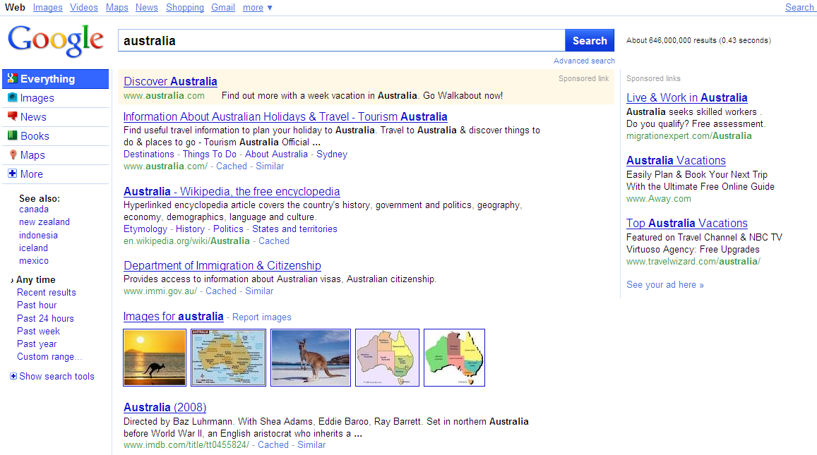
So have you noticed something different about Google lately? This past week Google rolled out a new look and some welcome features to their search platform. Least significant but still noticable is the refreshed Google logo on the home page; it’s definitely more colorful, isn’t it? Moving right along.. Google has added a “contextually relevant, left-hand navigation” panel to the search results page. Now whenever you search a keyword, a navigation panel reveals itself to help refine your query. There’s three parts to the panel. First there’s Universal Search; “the top section suggests the most relevant genres of results for your query and lets you seamlessly switch to these different types of results.” Everything is selected be default, but you have the option to switch the search feed depending on the type of information you’re looking for about the query. For example, if you search “wind power”, Google automatically does a normal search for the term, but now it also helps you find that term within other relevent places such as news, blogs, images, and books. Next there’s Search Options; this “enables you to get a different view of your results” by sorting search results by time, timelines, “wonder wheels”, image previews and more. Lastly there’s Google Squared; this addition utilizes Google’s “Something different” feature which “helps you find and compare entities” by offering other related topics to search. All of these new parts are built right into the left-hand navigation panel. Welcome to the modern age of Google search. Look after the break for a brief video rundown of the new features described here.
[Via GoogleBlog] Continue reading Google search gets a new look & feel
Macbook Pros get a refresh: faster Intel processors, NVIDIA graphics

On Tuesday Apple refreshed their Macbook Pro line, at long last. The 15.4 inch and 17 inch models now have 2010 Intel processors; the 13 inch model is sticking with Intel Core 2 Duo (2.4GHz/2.53 GHz). The 15.4 inch MBP can be puchased with a Core i5 (2.4 GHz/2.53 GHz) or Core i7 (2.66 GHz) processor, while the 17 inch MBP can be configured with this i5 (2.53 GHz) and i7 (2.66GHz). The 15 and 17 inch models got fitted with the NVIDIA GeForce GT 330M (256MB/512MB); the 13 incher’s got the NVIDIA GeForce 320M integrated graphics.
The GeForce GT 330M features “automatic graphics switching technology” a process whereby the computer automatically switches between using the integrated and discrete graphics. Apple describes how it works: it “switches graphics processors on the fly to give you performance when you need it (when you’re playing the latest 3D game, for example) and better battery efficiency when you don’t (such as when you’re reading email). MacBook Pro transfers the workload between the powerful discrete NVIDIA GeForce GT 330M graphics processor and integrated Intel HD Graphics so seamlessly, you won’t even notice.” That last part there is key; the user never has to worry about toggling on/off a graphics card. Depending on what type of application you’re using, it’s all done on the fly.
All MBPs come standard with 4GB of RAM and a hard drive (250GB for 13 inch, 320GB/500GB for 15 & 17 inch). There’s an option to swap out the HD for a solid state drive (128GB/256GB/512GB) on all models. Battery life on the 13 inch remains at 10 hours, while the 15 & 17 inch models will manage 8 to 9 hours on a single charge. There are three display options for the 15 inch: Glossy Widescreen (1440×900), Hi-Res Glossy Widescreen (1680×1050), and Hi-Res Antiglare Widescreen (1680×1050). The 17 inch comes with a 1920×1200 display, with glossy and antiglare options.
The unibody enclosure, ports and all, have stayed the same. The only new addition is one that cannot be seen, only touched: the multitouch trackpad now supports inertial scrolling, “an intuitive way to scroll through large photo libraries, lengthy documents and long web sites” just like you’re used to on the iPhone.
The 13 inch MBP starts at $1,199; the 15 inch base price has jumped $100 to $1,799; and the 17 inch starts at $2,299. They are all available to purchase today. Apple’s online store says all 15 & 17 inch models ship within 24 hours, but give the 13 inch 2-3 days to ship.
Long overdue, but they’re finally here. Faster processors, better graphics chips, new customizations. Here’s the deal: if you purchased a MBP within the last year, stick with that you got; if it’s been longer than that and you’ve been waiting for the new Intel processors to hit the MBP with bated breath, go for it. Look after the break for the full list of specs and customization options.
[Via Apple]
Continue reading Macbook Pros get a refresh: faster Intel processors, NVIDIA graphics
YouTube gets a facelift

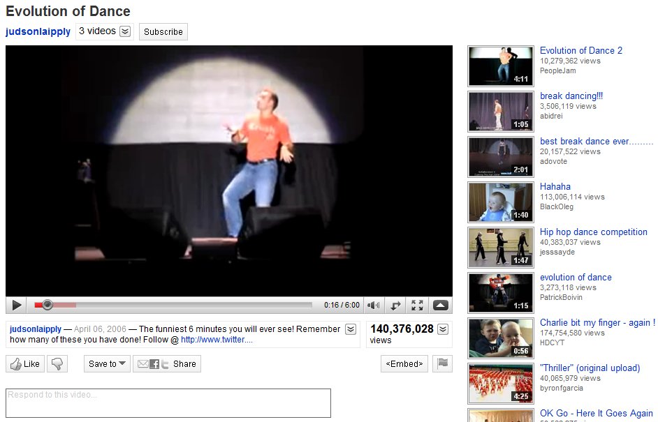
YouTube has gone ahead and given itself a makeover, pretty much making everything a whole lot more streamlined. The overall look is stripped down and clean, making the video player the most prominent part of the screen real estate. In the past, the user’s video information was placed in an expandable box to the right of the video. All of that has been move and broken up into two different place. Directly above the video player you’ll find the username link, more videos from that same user (when clicked it expands down to reveal a horizontal list of all their uploaded videos), and a subscribe button to subscribe to all of their videos. Directly below the player you’ll find the video description that expands down to show category, tags, and more information about the video. Next to the video description is the Views total; not only does it tell you the number of view the video has, but it can also be expanded down to share stats, links, and honors associated with the video. Underneath the video description you’ll find a panel of buttons called the Actions Bar. First there’s the new ratings system; a thumbs up/thumbs down model replaces the original 5 star rating system. The Save To button allows you to favorite a video or add it to one of your playlists. The Share button allows you to share the video via email, Facebook, Twitter, etc. Lastly there’s the Embed and Flag buttons, to copy the video inside another website and flag a video as inappropriate, respectively. If you happen to click on any video in a playlist, you will find the Next Up box, located in the top-right of the page. Next Up makes for a consistent viewing experience; depending on what you search, the Next Up box will queue up videos related to your search. And, if the auto-play option is turned on, the video player will automatically play the next video in the series as soon as the previous one is finished. The video player itself hasn’t really changed much. It includes the full screen and ‘make wider’ buttons, scrubbing controls with real-time time stamps, volume, and video quality options (360p to 1080p HD). Other neat updates include Closed Captioning (which can be turned on in certain videos where you find the Annotations toggle) and a cleaned up comment section.
Overall, the YouTube facelift really enhances the user experience. Everything is organized, tidied up, and looking better than ever. If it weren’t for those pesky ads, the whole thing would be downright perfect.
[Via YouTubeBlog]
Twitter homepage gets a refresh
![[homepage-screen.png]](http://1.bp.blogspot.com/_cmfm67YgFs4/S5_WB5CAb6I/AAAAAAAAAgI/oWnTVK_bWVY/s1600/homepage-screen.png)
Today Twitter pushed out a redesigned homepage. It’s definitely more effective than previous implementations due to its friendly nature that will likely appeal to non-Twitter users who are looking to find out more about the community. Trending topics and hashtags scroll along the top; what’s prominent now are the “see who’s here” and “top tweets” sections. These sections give visitors a sense of who is adding to the conversation and what‘s being talked about in a bit more detail. Twitter explains:
With the new design, we’re intentionally featuring more dynamic content on the front page, revealing a sample of who’s here, what folks are tweeting about, and the big topics that they’re discussing. The homepage now features a set of algorithmically-selected top tweets that automatically appear every few seconds. It also highlights a random sampling of suggested sources; hover over any of them to see a profile summary and their latest tweet. Trending topics now scroll across the page, allowing us to present a large set of trends using little page real estate. Hovering over some of these trends will show a description explaining why the keyword is (or has recently been) popular.
Now if there was only a way to get rid of all things Justin Beiber.
[Via TwitterBlog]
Google is refreshing its search interface, give it a try

Looks like Google is finally giving its first-born a refresh. At an unspecified date the main Google page and its search options will change in appearence. The interface promises to be cleaner, bolder, and and more accessable. Right now Google is testing out the new search features on random people. You haven’t been invited to the party? That’s OK, I’ve got the ticket to sneak you in the back entrance. It’s all after the break.
[Via Gizmodo, here, here & here; SearchEngineLand]
Continue reading Google is refreshing its search interface, give it a try
Get your Apple refresh, hear all about it!

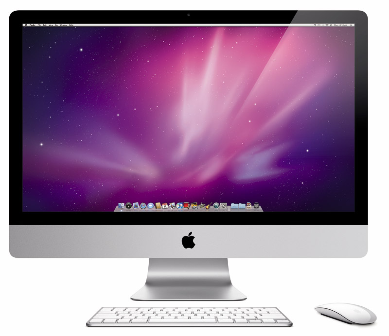
Today Apple performed its yearly upgrade to its iMac desktop line (among other things). Apple also introduced a brand new product as well! Let’s dive right into it, shall we?
LOOK AFTER THE BREAK FOR THE BREAKDOWN. Continue reading Get your Apple refresh, hear all about it!


